SENSEX Multi-Straddle Chart | Live Multi-Straddle Premium
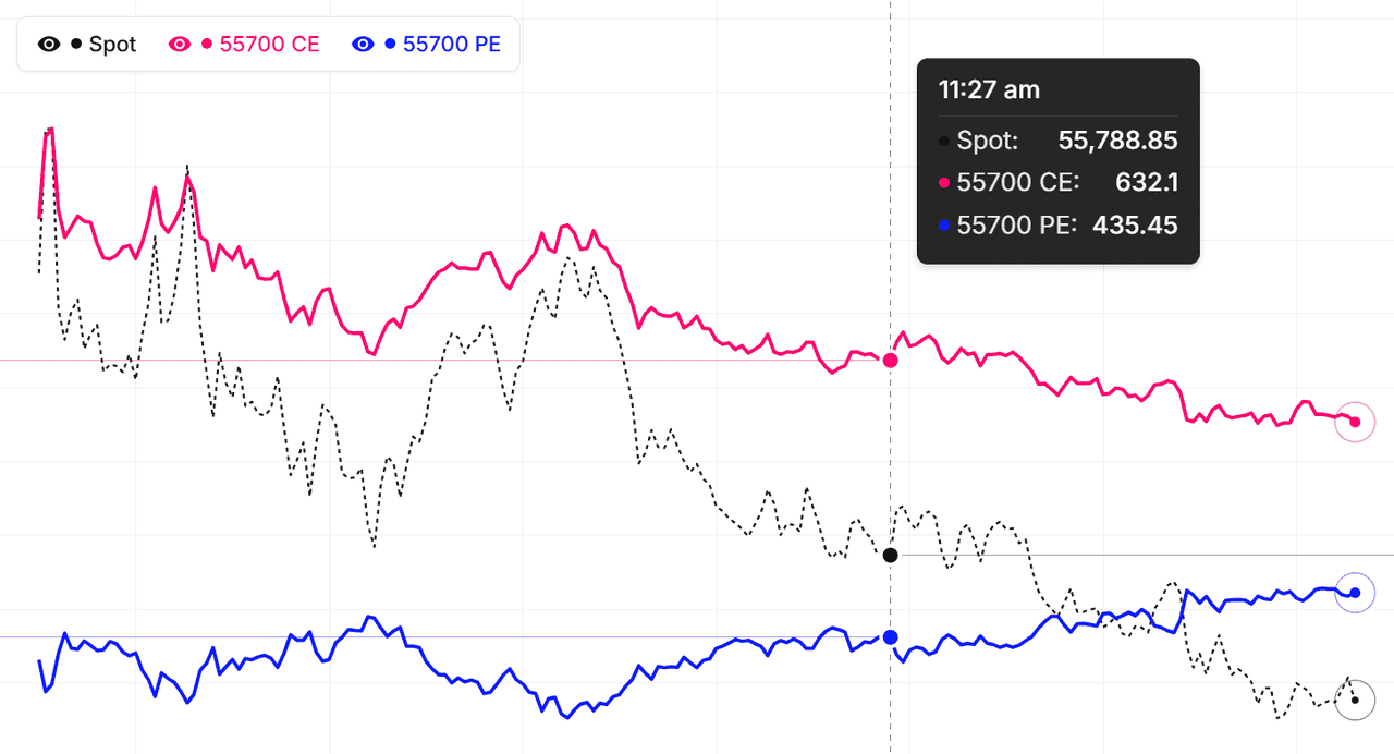
The multi-straddle chart for SENSEX lets you overlay the combined CE + PE premium of several strikes on a single chart, so you can see how each strike's straddle is repricing through the session. Instead of switching between individual straddle charts, you get a unified view of SENSEX's straddle structure in one place.
This is particularly powerful for SENSEX volatility traders. Watch how ATM, near-ATM, and OTM straddles are repricing in real time to read the skew. If OTM is richening faster than ATM, the market is pricing tail risk — useful information before events. If far-OTM is collapsing while ATM holds, mean reversion is underway. Combined mode lets you treat several straddles as a single basket premium — useful for strangle baskets or far-wing exposure.
Using SENSEX multi-straddle data for strategy construction
Before entering a short-volatility position on SENSEX, overlay the candidate straddles and study how they have moved together over the session. Two straddles that should move in tandem but diverged often signal a pricing anomaly worth trading. Live mode streams every selected SENSEX straddle in real time.
Complement the multi-straddle chart with our ATM Straddle, Multi-Strike Chart, Premium Decay, and Live Option Chain tools for richer SENSEX option-market analysis on NSE.
BSE Sensex (SENSEX) Multi-Straddle Chart: Volatility Regime
Identifying the SENSEX volatility regime
A volatility regime is the overall state of the IV surface. The multi-straddle chart visualises it: flat, gently-declining lines = low-vol regime; jumpy, separated lines with sharp moves = high-vol regime. Knowing the regime tells you which strategies fit BSE Sensex right now.
Low-vol regime characteristics
Low-vol regimes produce calm multi-straddle charts. All lines drift down at similar rates — pure theta. Spacing between strikes stays steady. Premium-selling strategies (short strangles, iron condors) work here because the decay is reliable and large moves are unlikely.
High-vol regime characteristics
High-vol regimes produce active, jumpy lines. Straddles can spike sharply intraday. The IV term structure may invert. Long-premium strategies (long straddles, calendars) work better here because the moves can offset the time decay.
Adjusting to regime on SENSEX as of 21 September 2026
Check the multi-straddle chart shape before every trade. The same strategy that worked yesterday may fail today if the regime shifted. Regime awareness is the single most important skill in options trading — and the chart gives it to you at a glance.
BSE Sensex (SENSEX) Multi-Straddle Chart: Pro Tips
Tip 1: Watch rate of change, not absolute values
A straddle at 200 tells you less than a straddle moving from 180 to 210 in 10 minutes. Rate of change is the actionable signal. Train your eye to see speed, not just level — rapid line movements indicate active order flow, possibly institutional, while slow drift is just routine.
Tip 2: Compare straddles relative to each other on SENSEX
Absolute levels matter less than spacing. If ATM is 200 and OTM is 100, that's a 100-point spacing. If tomorrow ATM is 220 and OTM is 90, both are richer/cheaper in absolute terms but the spacing changed too — something shifted in skew. Spacing changes are real signals on BSE Sensex.
Tip 3: Watch line crossovers
When two straddle lines cross — for example an OTM-put straddle crossing above the ATM straddle — something significant has shifted in skew. These crossovers are rare but informative. They often precede meaningful directional moves or volatility regime changes.
Tip 4: Build a daily routine as of 21 September 2026
Check the chart at fixed times, classify the regime, note unusual patterns, write observations. Consistency compounds. As of 21 September 2026, the SENSEX trader who runs this routine for 60 days outperforms the one who trades reactively without structure. As a major Broad Market index on BSE, BSE Sensex rewards disciplined chart study.
BSE Sensex (SENSEX) Multi-Straddle Chart: Premium Decay Timing
When does theta hit hardest on SENSEX?
Theta accelerates as expiry approaches. On weekly options, the last 2-3 days see the steepest decay. On the multi-straddle chart, this shows as the downward slope getting visibly steeper across all straddle lines. ATM straddles decay fastest near expiry; far-OTM are mostly already at minimal premium.
Reading expiry-week behaviour on BSE Sensex
On expiry day, the chart can be deceptive. ATM straddle can move sharply on tiny SENSEX price changes (gamma effect). Far-OTM straddles approach zero. The chart's spacing compresses as far-OTM collapses. This is a known pattern — expecting it prevents bad trades on expiry day.
Cross-expiry comparisons
When switching between weekly and monthly expiries, the chart shape changes dramatically. Monthly has slower theta and flatter slope. Weekly has steeper slope and faster intraday moves. Match your strategy to the expiry — short-theta strategies favour weeklies; long-theta strategies favour monthlies.
Theta-timing strategies as of 21 September 2026
Selling premium 5-10 days from expiry on SENSEX captures meaningful decay without too much gamma risk. The multi-straddle chart helps confirm conditions are right — flat shape, low-vol regime, no event ahead. As of 21 September 2026, expiry rhythm on BSE Sensex weeklies has been the consistent profile.
SENSEX multi-straddle patterns: quick reference
| Cross-strike pattern | Volatility read | Common interpretation |
|---|---|---|
| All straddles rising together | Volatility expansion | Market pricing a bigger SENSEX move; long-volatility setups favoured |
| All straddles falling together | Volatility compression | Theta decay dominating; range-bound session, premium sellers in control |
| OTM rising faster than ATM | Skew steepening | Tail risk being priced — common before RBI policy, Budget, or results |
| OTM falling while ATM holds | Skew flattening | Event premium unwinding; volatility mean-reverting |
| Two normally-tracking straddles diverging | Pricing anomaly | Relative-value opportunity; check strike liquidity before trading it |
Read these regimes from the relative slopes of the straddle lines, not absolute premium levels — every symbol trades at a different premium scale. The live SENSEX chart above replots every selected straddle each minute during market hours, so an expansion, compression, or skew shift shows up within minutes of the market repricing it.
How to use the Multi-Straddle Chart
- Pick the underlying and expiry — Choose Nifty, BankNifty, or any F&O stock. Pick the expiry whose straddles you want to compare.
- Add straddles — Click strikes from the available list. Each click adds one straddle (both CE and PE at that strike). Up to 5 straddles can plot together.
- Choose Individual or Combined — Individual: each straddle as its own line. Combined: sum of all selected straddles, with a Line/Candle toggle.
- Pick Simple or Drawing chart — Simple for quick analysis. Drawing adds trendlines, fib, and full TradingView toolkit.
- Live or Historical — Live for current-session monitoring. Historical for replaying past events or back-testing.
SENSEX Multi-Straddle Chart — Frequently Asked Questions
What is SENSEX Multi-Straddle Chart?
SENSEX Multi-Straddle Chart displays multiple option straddles (CE + PE per strike) on a single chart, allowing you to compare combined premiums across different strikes and identify volatility skew patterns for better trading decisions. Each line is direction-neutral, so what you are comparing is pure volatility and time-decay behaviour per strike.
How to use Multi-Straddle Chart for SENSEX?
Pick up to 5 SENSEX strikes — each adds a straddle (CE + PE). Use Individual mode to compare straddles side by side, or Combined mode to see them summed as a single basket premium. Switch to Drawing mode for trendlines, fib levels, and advanced annotations.
How is the SENSEX Multi-Straddle Chart different from a single straddle chart?
A single straddle chart tracks one strike's combined CE + PE premium, usually ATM. The SENSEX multi-straddle chart overlays up to 5 straddles at once, so you can compare how ATM, near-ATM, and OTM strikes reprice relative to each other. That cross-strike view exposes volatility skew and pricing anomalies a single-straddle chart cannot show.
What does it mean when SENSEX OTM straddles rise faster than the ATM straddle?
It signals skew steepening — the market is bidding up tail risk on SENSEX and paying more for movement beyond those OTM strikes, a pattern common before RBI policy, Budget, or earnings. The reverse — OTM straddles collapsing while the ATM holds — means event premium is unwinding and volatility is mean-reverting.
How often does the SENSEX Multi-Straddle Chart update?
During NSE market hours (9:15 AM to 3:40 PM IST) every selected SENSEX straddle refreshes every minute from live CE and PE prices. Outside market hours the chart shows the last traded session, and Historical mode lets you replay the full SENSEX straddle structure for any past trading day and expiry.