SENSEX Multi-Strike Chart | Live Multi-Strike Premium
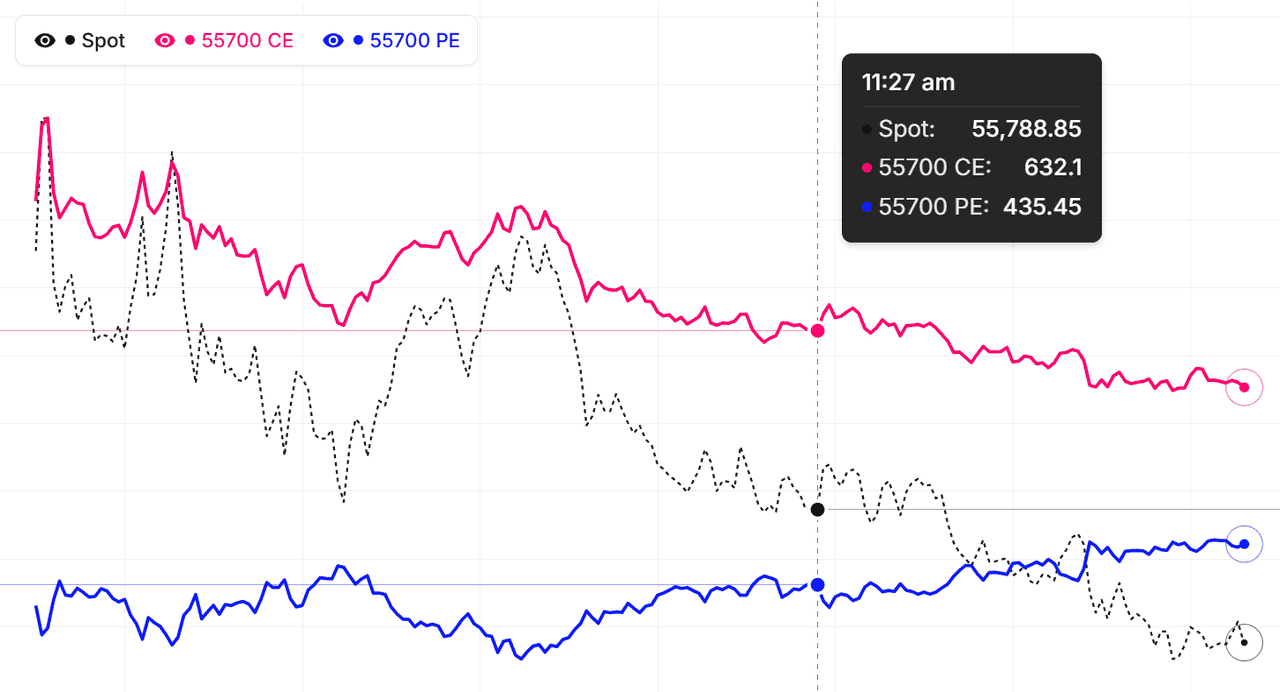
The multi-strike chart for SENSEX lets you overlay the premium behaviour of several strikes on a single chart — both calls and puts, across expiries — so you can see how each strike is reacting to spot movement, theta, and changes in implied volatility. Instead of switching between individual strike charts, you get a unified view of the whole SENSEX option chain's price action in one place.
This is particularly powerful for SENSEX traders running multi-leg strategies. Watch an iron condor's four legs at once to understand real-time P/L dynamics as spot drifts toward a short strike. Track a ratio spread's break-even point by watching both strikes move together. Compare how deep-OTM vs near-ATM SENSEX calls respond to the same underlying move, and see the volatility skew reflected in premium behaviour rather than theoretical IV numbers.
Using SENSEX multi-strike data for strategy construction
Before building a SENSEX strategy, overlay the strikes you're considering on one chart and study how their premiums have moved together (or diverged) over the session — or historically. If two strikes that should move in tandem start diverging, that's often a pricing anomaly you can trade. For direction-based plays, you can quickly identify which strike gave the best risk-reward for past SENSEX moves and apply the same filter to today's setup. Live mode streams every selected SENSEX strike in real time.
Complement the multi-strike chart with our ATM Straddle, Premium Decay, and Live Option Chain tools for richer SENSEX option-market analysis on NSE.
BSE Sensex (SENSEX) Multi-Strike Chart: Volatility Regime Detection
What is a volatility regime on SENSEX?
A volatility regime is the overall state of option premium behaviour. Low-vol regimes have flat, compressed multi-strike charts — all lines drift slowly downward. High-vol regimes have active, separated lines that move sharply. Knowing the regime tells you which strategies are likely to work on BSE Sensex.
Identifying low-vol regimes visually
On the SENSEX chart, low-vol regimes look calm. Strike lines move slowly. Spacing stays consistent. Premium decay is gradual. These conditions favour premium-selling strategies — short strangles, iron condors, and covered calls. The steady decay is your profit source when volatility stays low.
Identifying high-vol regimes on SENSEX
High-vol regimes produce jumpy, separated lines. Strike premiums diverge quickly. Spread widths change rapidly. These are better for long-premium strategies — long straddles, strangles, and directional option buying. The potential for large premium spikes offsets the faster decay.
Adjusting strategy to regime on SENSEX
Check the multi-strike chart shape before every trade. If it is calm, lean toward selling premium. If it is jumpy, lean toward buying or spreads. Do not force the same strategy in all conditions — regime awareness is the single most important skill in options trading. As of 13 October 2026, the chart gives you this read instantly.
BSE Sensex (SENSEX) Multi-Strike Chart: Pro Tips
Tip 1: watch rate of change, not absolute values
A premium at 200 tells you less than a premium moving from 180 to 200 in 10 minutes. Rate of change is the actionable signal. Train your eye to see speed, not just position. For BSE Sensex, rapid line movements indicate active order flow — possibly institutional — while slow drift is just routine.
Tip 2: compare strikes relative to each other
Absolute premium levels matter less than relative spacing. If the ATM is 100 and the OTM is 50, that is a 50% gap. If tomorrow the gap is only 30%, something has changed — the OTM is relatively more expensive or the ATM relatively cheaper. These relative shifts reveal real information on SENSEX positioning.
Tip 3: use SENSEX crossovers as alerts
When two strike lines cross over each other, it signals a significant relative value shift. These crossovers are visible at a glance and often precede meaningful moves. They do not happen often, but when they do, they are worth investigating.
Tip 4: build a SENSEX daily routine
Check the chart at fixed times, classify the regime, note any unusual patterns, and write observations in your journal. Consistency creates compounding insights over weeks and months. As of 13 October 2026, the trader who practices this routine for 60 days outperforms the one who trades reactively without structure. As a major Broad Market index on BSE, BSE Sensex rewards disciplined chart study.
BSE Sensex (SENSEX) Multi-Strike Chart: Leading and Lagging Strikes
What is a leading strike on SENSEX?
A leading strike is one whose premium moves first in response to price changes. For BSE Sensex, the ATM strike usually leads because it has the highest delta and gamma. But in certain setups, a slightly OTM strike can lead if it is absorbing more activity. Identifying the leader tells you where the action is.
What is a lagging strike?
Lagging strikes move after the leaders. They are slower to respond to price changes, often because they have lower delta. In spread trades, you want to buy lagging strikes (they are relatively cheap for where price is going) and sell leading strikes (they are relatively expensive). This lead-lag timing is part of what makes multi-strike analysis valuable.
Spotting lead-lag relationships on SENSEX
Watch which line moves first when BSE Sensex spot ticks. The fastest to react is leading. The slowest is lagging. Consistent leaders and laggards across multiple price moves are stable — trade them. Random leadership is noise — ignore it. The chart makes these patterns easy to spot.
Trading lead-lag on SENSEX
When the lag between a leading and lagging strike is large, the lagging strike has catch-up potential. Buy the laggard, wait for it to catch up. Sell the leader if you expect the spread to widen. These are niche strategies but they exploit inefficiencies the multi-strike chart exposes. As of 13 October 2026, lead-lag trades work best in trending sessions on BSE Sensex.
SENSEX premium comparison across strikes: quick reference
| Strike zone | Typical delta | How its premium line behaves on the overlay |
|---|---|---|
| Deep ITM | Above 0.90 | Tracks the SENSEX future almost point-for-point; flattest decay, mostly intrinsic value |
| ITM | 0.60 – 0.80 | Strong directional response to spot with modest time decay between moves |
| ATM | ~0.50 | Highest gamma and theta — the fastest-swinging and fastest-decaying line on the chart |
| OTM | 0.20 – 0.40 | Rises only on sustained trend or IV expansion; bleeds steadily when SENSEX consolidates |
| Deep OTM | Below 0.20 | Near-flat most sessions; spikes on sharp spot moves or vol events, then decays back |
Because every SENSEX strike carries a different delta, gamma, and theta mix, their premium lines never move identically — the overlay makes those differences visible. Compare each strike's actual line against the behaviour expected for its zone: a line moving out of character is often the first sign of a volatility-skew shift or a tradeable pricing anomaly.
How to use the Multi-Strike Chart
- Pick the underlying and expiry — Choose Nifty, BankNifty, or any F&O stock. Pick the expiry that holds your strikes.
- Add the strikes you want to overlay — Click strikes on the option chain or type them in. Up to 8-10 strikes can plot cleanly together.
- Choose call, put, or both — Toggle each strike between CE, PE, or both. Colour-coding makes it easy to track each line.
- Pick live or historical mode — Live for current-session monitoring. Historical for back-testing or post-mortem analysis on past trades.
- Read the divergence signals — Strikes that should move in tandem but are diverging often signal pricing anomalies or skew shifts. Both are tradeable in the right context.
SENSEX MultiStrike Chart — Frequently Asked Questions
What is SENSEX MultiStrike Chart?
SENSEX MultiStrike Chart displays multiple option strikes on a single chart, allowing you to compare price movements across different strikes simultaneously for better trading decisions.
How to use MultiStrike Chart for SENSEX?
Select multiple SENSEX strikes you want to track. Compare how different strikes react to underlying moves. Identify which strikes offer better risk-reward based on price behavior patterns.
What does it mean when two SENSEX strikes diverge on the multi-strike chart?
Divergence between SENSEX strikes that normally move in tandem usually signals a volatility-skew shift or a pricing anomaly. If an OTM put premium climbs while the ATM stays flat, put-side IV is being bid — a fear signal. Spread traders treat sustained divergence as a relative-value setup: buy the lagging strike, sell the leading one.
How many SENSEX strikes can I overlay at once?
You can overlay up to 20 SENSEX strikes simultaneously, though 5-8 strikes centred on the ATM plot most cleanly. Each line is colour-coded, and every strike can be toggled between CE, PE, or both — across weekly and monthly expiries. Deep-OTM strikes on illiquid names add noise, so stick to actively traded strikes for readable comparisons.
How often does the SENSEX multi-strike chart update?
During NSE market hours (9:15 AM to 3:40 PM IST) every selected SENSEX strike refreshes every minute from live option-price data. Outside market hours the chart shows the last traded session, and historical mode lets you replay any past SENSEX expiry to back-test how each strike behaved intraday.