INFY Multi-Strike Chart | Live Multi-Strike Premium
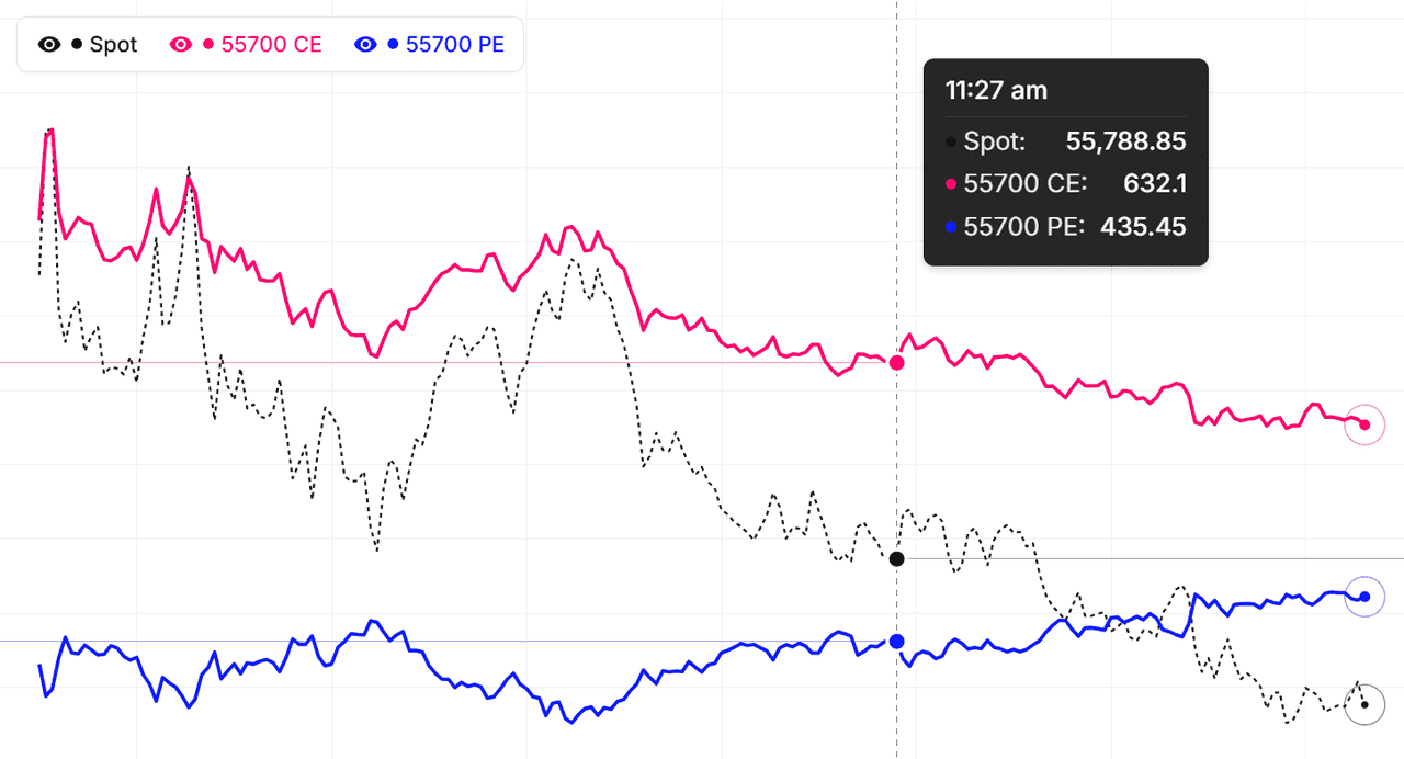
The multi-strike chart for INFY lets you overlay the premium behaviour of several strikes on a single chart — both calls and puts, across expiries — so you can see how each strike is reacting to spot movement, theta, and changes in implied volatility. Instead of switching between individual strike charts, you get a unified view of the whole INFY option chain's price action in one place.
This is particularly powerful for INFY traders running multi-leg strategies. Watch an iron condor's four legs at once to understand real-time P/L dynamics as spot drifts toward a short strike. Track a ratio spread's break-even point by watching both strikes move together. Compare how deep-OTM vs near-ATM INFY calls respond to the same underlying move, and see the volatility skew reflected in premium behaviour rather than theoretical IV numbers.
Using INFY multi-strike data for strategy construction
Before building a INFY strategy, overlay the strikes you're considering on one chart and study how their premiums have moved together (or diverged) over the session — or historically. If two strikes that should move in tandem start diverging, that's often a pricing anomaly you can trade. For direction-based plays, you can quickly identify which strike gave the best risk-reward for past INFY moves and apply the same filter to today's setup. Live mode streams every selected INFY strike in real time.
Complement the multi-strike chart with our ATM Straddle, Premium Decay, and Live Option Chain tools for richer INFY option-market analysis on NSE.
Infosys Ltd (INFY) Multi-Strike Chart: What It Shows
What is the INFY multi-strike chart?
The multi-strike chart for Infosys Ltd (INFY) displays premium movement across several option strikes on a single chart. Instead of looking at one strike's price over time, you see how 5-8 strikes behave together. This comparative view reveals which strikes are leading price action, which are lagging, and where mispricings exist. As a NIFTY constituent, Infosys Ltd strikes are actively traded enough to make this comparison meaningful throughout each session.
How is this different from the option chain?
The option chain shows a single snapshot at each moment — all strikes at one time. The multi-strike chart shows a time series — each strike over time. You get to see HOW premium evolves, not just where it currently sits. For traders who hold positions across multiple strikes, the chart is the better view because it shows the co-movement pattern essential for spread trading and relative value analysis on INFY.
Which INFY strikes should I chart together?
The most informative multi-strike charts focus on nearby strikes — typically the ATM plus 2-3 above and 2-3 below. These strikes move most in sync and reveal relative value opportunities. Including far-OTM strikes can clutter the chart with low-premium lines that do not move much. For Infosys Ltd analysis, 5-8 strikes is the practical sweet spot for reading patterns clearly.
Getting started with INFY multi-strike charts today
As of 13 October 2026, pick 5 strikes centred around the current INFY price. Watch how their premium lines move relative to each other through the session. Note which ones lead moves, which follow, and which stay flat. After a few sessions you will develop intuition for normal versus unusual patterns on Infosys Ltd.
Infosys Ltd (INFY) Multi-Strike Chart: Around Major Events
Pre-event INFY multi-strike behaviour
Before major events like Infosys Ltd earnings or major corporate announcements, the INFY multi-strike chart shows premium inflation across all strikes. IV expansion lifts every line. The spacing between strikes can also shift as specific strikes see more hedging demand.
Event-day INFY chart dynamics
On the day of a major event, the multi-strike chart often shows dramatic moves once the news hits. Premiums can spike and then collapse within minutes as IV crushes post-announcement. Watching multiple strikes reveals which benefited and which suffered — important for understanding which side of the event was unexpected.
Post-event INFY normalisation
After events resolve, the multi-strike chart shows rapid premium decay as IV returns to normal. All lines collapse together, often sharply. This is the classic IV crush pattern. Traders who sold premium before the event capture this decay. Traders who bought are punished unless direction moved strongly enough.
Event-trading with INFY multi-strike as of 13 October 2026
Before event days, watch the multi-strike chart for pre-event inflation. After events, watch for post-event normalisation. These two patterns are the most reliable signals around events on Infosys Ltd. Avoid trading during the actual announcement period because moves are too fast and too risky.
Infosys Ltd (INFY) Multi-Strike Chart: Combining With Price Chart
Why watch both INFY charts together?
Premium charts show volatility. Price charts show direction. Both together give you a complete picture. A breakout on the price chart is more reliable when the multi-strike chart shows premium expansion in the same direction. Combining them filters false signals on Infosys Ltd.
Bullish confluence on INFY
The best long setups happen when Infosys Ltd breaks above resistance on the price chart AND the multi-strike chart shows call premiums expanding faster than puts. Both price and options agree on direction. Enter with confidence, set stops below the breakout level, target the next resistance.
Bearish confluence on INFY
The mirror setup — price breaking support while put premiums expand faster than calls on the multi-strike chart. Both signals agree on bearish direction. Short positions or long puts work well here. As of 13 October 2026, these confluence trades are worth waiting for.
Divergence warnings on INFY
When price and premium charts disagree, caution is needed. Rising price with collapsing premiums means the move is running out of steam. Falling price with expanding premiums means the decline has conviction but be ready for volatile reversals. Divergences require more careful analysis than confluences.
INFY premium comparison across strikes: quick reference
| Strike zone | Typical delta | How its premium line behaves on the overlay |
|---|---|---|
| Deep ITM | Above 0.90 | Tracks the INFY future almost point-for-point; flattest decay, mostly intrinsic value |
| ITM | 0.60 – 0.80 | Strong directional response to spot with modest time decay between moves |
| ATM | ~0.50 | Highest gamma and theta — the fastest-swinging and fastest-decaying line on the chart |
| OTM | 0.20 – 0.40 | Rises only on sustained trend or IV expansion; bleeds steadily when INFY consolidates |
| Deep OTM | Below 0.20 | Near-flat most sessions; spikes on sharp spot moves or vol events, then decays back |
Because every INFY strike carries a different delta, gamma, and theta mix, their premium lines never move identically — the overlay makes those differences visible. Compare each strike's actual line against the behaviour expected for its zone: a line moving out of character is often the first sign of a volatility-skew shift or a tradeable pricing anomaly.
How to use the Multi-Strike Chart
- Pick the underlying and expiry — Choose Nifty, BankNifty, or any F&O stock. Pick the expiry that holds your strikes.
- Add the strikes you want to overlay — Click strikes on the option chain or type them in. Up to 8-10 strikes can plot cleanly together.
- Choose call, put, or both — Toggle each strike between CE, PE, or both. Colour-coding makes it easy to track each line.
- Pick live or historical mode — Live for current-session monitoring. Historical for back-testing or post-mortem analysis on past trades.
- Read the divergence signals — Strikes that should move in tandem but are diverging often signal pricing anomalies or skew shifts. Both are tradeable in the right context.
INFY MultiStrike Chart — Frequently Asked Questions
What is INFY MultiStrike Chart?
INFY MultiStrike Chart displays multiple option strikes on a single chart, allowing you to compare price movements across different strikes simultaneously for better trading decisions.
How to use MultiStrike Chart for INFY?
Select multiple INFY strikes you want to track. Compare how different strikes react to underlying moves. Identify which strikes offer better risk-reward based on price behavior patterns.
What does it mean when two INFY strikes diverge on the multi-strike chart?
Divergence between INFY strikes that normally move in tandem usually signals a volatility-skew shift or a pricing anomaly. If an OTM put premium climbs while the ATM stays flat, put-side IV is being bid — a fear signal. Spread traders treat sustained divergence as a relative-value setup: buy the lagging strike, sell the leading one.
How many INFY strikes can I overlay at once?
You can overlay up to 20 INFY strikes simultaneously, though 5-8 strikes centred on the ATM plot most cleanly. Each line is colour-coded, and every strike can be toggled between CE, PE, or both — across weekly and monthly expiries. Deep-OTM strikes on illiquid names add noise, so stick to actively traded strikes for readable comparisons.
How often does the INFY multi-strike chart update?
During NSE market hours (9:15 AM to 3:40 PM IST) every selected INFY strike refreshes every minute from live option-price data. Outside market hours the chart shows the last traded session, and historical mode lets you replay any past INFY expiry to back-test how each strike behaved intraday.