FINNIFTY Multi-Straddle Chart | Live Multi-Straddle Premium
The multi-straddle chart for FINNIFTY lets you overlay the combined CE + PE premium of several strikes on a single chart, so you can see how each strike's straddle is repricing through the session. Instead of switching between individual straddle charts, you get a unified view of FINNIFTY's straddle structure in one place.
This is particularly powerful for FINNIFTY volatility traders. Watch how ATM, near-ATM, and OTM straddles are repricing in real time to read the skew. If OTM is richening faster than ATM, the market is pricing tail risk — useful information before events. If far-OTM is collapsing while ATM holds, mean reversion is underway. Combined mode lets you treat several straddles as a single basket premium — useful for strangle baskets or far-wing exposure.
Using FINNIFTY multi-straddle data for strategy construction
Before entering a short-volatility position on FINNIFTY, overlay the candidate straddles and study how they have moved together over the session. Two straddles that should move in tandem but diverged often signal a pricing anomaly worth trading. Live mode streams every selected FINNIFTY straddle in real time.
Complement the multi-straddle chart with our ATM Straddle, Multi-Strike Chart, Premium Decay, and Live Option Chain tools for richer FINNIFTY option-market analysis on NSE.
Nifty Financial Services (FINNIFTY) Multi-Straddle Chart: vs Multi-Strike Chart
What's different about straddle vs single-leg analysis?
The multi-strike chart shows individual CE or PE lines, which move with both direction and IV. The multi-straddle chart shows CE + PE summed per strike — direction cancels and IV dominates. For a FINNIFTY trader thinking about volatility (not direction), the straddle view is cleaner and more honest. You see what the market is pricing for movement at each strike.
When to use each chart on Nifty Financial Services?
Use the multi-strike chart when you care about call vs put behaviour separately — for example, when running directional spreads. Use the multi-straddle chart when you care about volatility levels and skew — for example, when planning a strangle, gauging event risk, or comparing realised vs implied moves.
What about combined mode on the FINNIFTY straddle chart?
Combined mode sums all selected straddles into a single line or candle. This is your "basket premium" — useful when you want a one-line read on total volatility exposure across a range of strikes. It's especially helpful for measuring how a strangle or strangle ladder is repricing on Nifty Financial Services through the day.
Picking the right tool as of 21 September 2026
For FINNIFTY session-by-session analysis, the multi-straddle chart is the volatility lens. The multi-strike chart is the directional lens. Most experienced traders watch both in different tabs and switch based on what they're thinking about that day.
Nifty Financial Services (FINNIFTY) Multi-Straddle Chart: Reading Time Decay
What does theta look like on the FINNIFTY chart?
Theta — time decay — shows as a downward drift across all straddle lines through the session. On a calm day, every line slopes gently down at roughly the same rate. The slope steepens as expiry approaches. On the Nifty Financial Services chart this drift is the baseline — anything that breaks the drift is information.
Detecting accelerated decay
If a straddle line starts dropping faster than its neighbours, accelerated decay is happening. Usually because IV is leaving that specific strike — perhaps the market lost interest after a non-event. This is your signal to take profit on short positions at that strike, before the easy decay is gone.
Detecting stalled decay
If a straddle line stops decaying and goes sideways or up, theta is being offset by IV expansion. Something is keeping the premium up — usually fresh positioning or anticipation of an event. Short positions at that strike are in danger; long positions may have catch-up potential.
Theta strategies on FINNIFTY as of 21 September 2026
The cleanest theta-harvesting environment is a flat multi-straddle chart with all lines decaying together. The cleanest gamma-scalping environment is a jumpy chart with active line movements. Use the chart shape to decide which side of the volatility trade you're on.
Nifty Financial Services (FINNIFTY) Multi-Straddle Chart: FAQ
What data does the FINNIFTY multi-straddle chart show?
It plots the sum of CE and PE premiums at each selected strike — the "straddle premium" — over time. Each line is one strike. Values update minute by minute during NSE hours and can be replayed for any past trading date in historical mode.
How is it different from the ATM Straddle chart?
The ATM Straddle tool shows just the at-the-money straddle. The multi-straddle chart shows several straddles together for comparison. ATM-only is best for tracking one position; multi-straddle is best for skew and relative-value analysis on Nifty Financial Services.
How many straddles can I overlay?
Up to 5 simultaneously. Beyond that the chart becomes hard to read. Five is the sweet spot — enough to see skew and breadth, few enough to keep each line distinct.
What other FINNIFTY tools complement this?
The ATM Straddle, the option chain, multi-strike chart, and multi-strike OI tools all complement multi-straddle analysis. Each shows a different dimension — premium, snapshot, individual legs, positioning. Together they cover the full Nifty Financial Services options market as of 21 September 2026.
FINNIFTY multi-straddle patterns: quick reference
| Cross-strike pattern | Volatility read | Common interpretation |
|---|---|---|
| All straddles rising together | Volatility expansion | Market pricing a bigger FINNIFTY move; long-volatility setups favoured |
| All straddles falling together | Volatility compression | Theta decay dominating; range-bound session, premium sellers in control |
| OTM rising faster than ATM | Skew steepening | Tail risk being priced — common before RBI policy, Budget, or results |
| OTM falling while ATM holds | Skew flattening | Event premium unwinding; volatility mean-reverting |
| Two normally-tracking straddles diverging | Pricing anomaly | Relative-value opportunity; check strike liquidity before trading it |
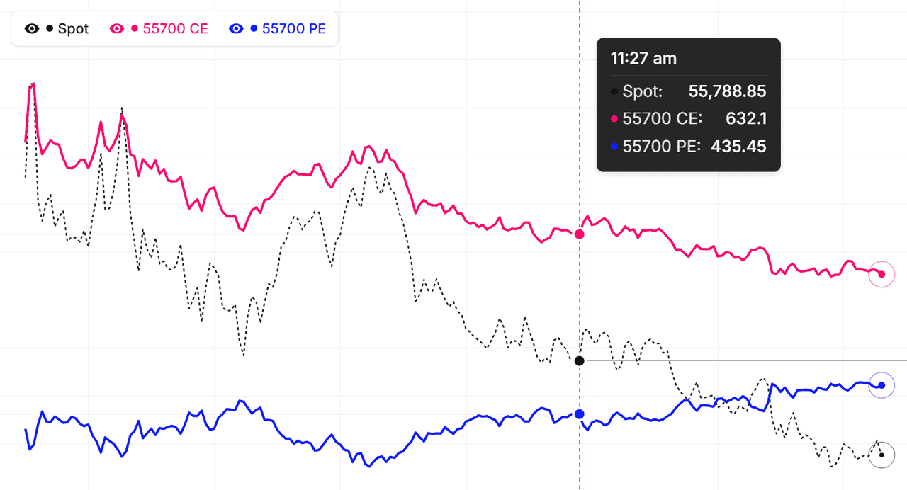
Read these regimes from the relative slopes of the straddle lines, not absolute premium levels — every symbol trades at a different premium scale. The live FINNIFTY chart above replots every selected straddle each minute during market hours, so an expansion, compression, or skew shift shows up within minutes of the market repricing it.
How to use the Multi-Straddle Chart
- Pick the underlying and expiry — Choose Nifty, BankNifty, or any F&O stock. Pick the expiry whose straddles you want to compare.
- Add straddles — Click strikes from the available list. Each click adds one straddle (both CE and PE at that strike). Up to 5 straddles can plot together.
- Choose Individual or Combined — Individual: each straddle as its own line. Combined: sum of all selected straddles, with a Line/Candle toggle.
- Pick Simple or Drawing chart — Simple for quick analysis. Drawing adds trendlines, fib, and full TradingView toolkit.
- Live or Historical — Live for current-session monitoring. Historical for replaying past events or back-testing.
FINNIFTY Multi-Straddle Chart — Frequently Asked Questions
What is FINNIFTY Multi-Straddle Chart?
FINNIFTY Multi-Straddle Chart displays multiple option straddles (CE + PE per strike) on a single chart, allowing you to compare combined premiums across different strikes and identify volatility skew patterns for better trading decisions. Each line is direction-neutral, so what you are comparing is pure volatility and time-decay behaviour per strike.
How to use Multi-Straddle Chart for FINNIFTY?
Pick up to 5 FINNIFTY strikes — each adds a straddle (CE + PE). Use Individual mode to compare straddles side by side, or Combined mode to see them summed as a single basket premium. Switch to Drawing mode for trendlines, fib levels, and advanced annotations.
How is the FINNIFTY Multi-Straddle Chart different from a single straddle chart?
A single straddle chart tracks one strike's combined CE + PE premium, usually ATM. The FINNIFTY multi-straddle chart overlays up to 5 straddles at once, so you can compare how ATM, near-ATM, and OTM strikes reprice relative to each other. That cross-strike view exposes volatility skew and pricing anomalies a single-straddle chart cannot show.
What does it mean when FINNIFTY OTM straddles rise faster than the ATM straddle?
It signals skew steepening — the market is bidding up tail risk on FINNIFTY and paying more for movement beyond those OTM strikes, a pattern common before RBI policy, Budget, or earnings. The reverse — OTM straddles collapsing while the ATM holds — means event premium is unwinding and volatility is mean-reverting.
How often does the FINNIFTY Multi-Straddle Chart update?
During NSE market hours (9:15 AM to 3:40 PM IST) every selected FINNIFTY straddle refreshes every minute from live CE and PE prices. Outside market hours the chart shows the last traded session, and Historical mode lets you replay the full FINNIFTY straddle structure for any past trading day and expiry.