SENSEX Call vs Put Open Interest | Live Sentiment Chart
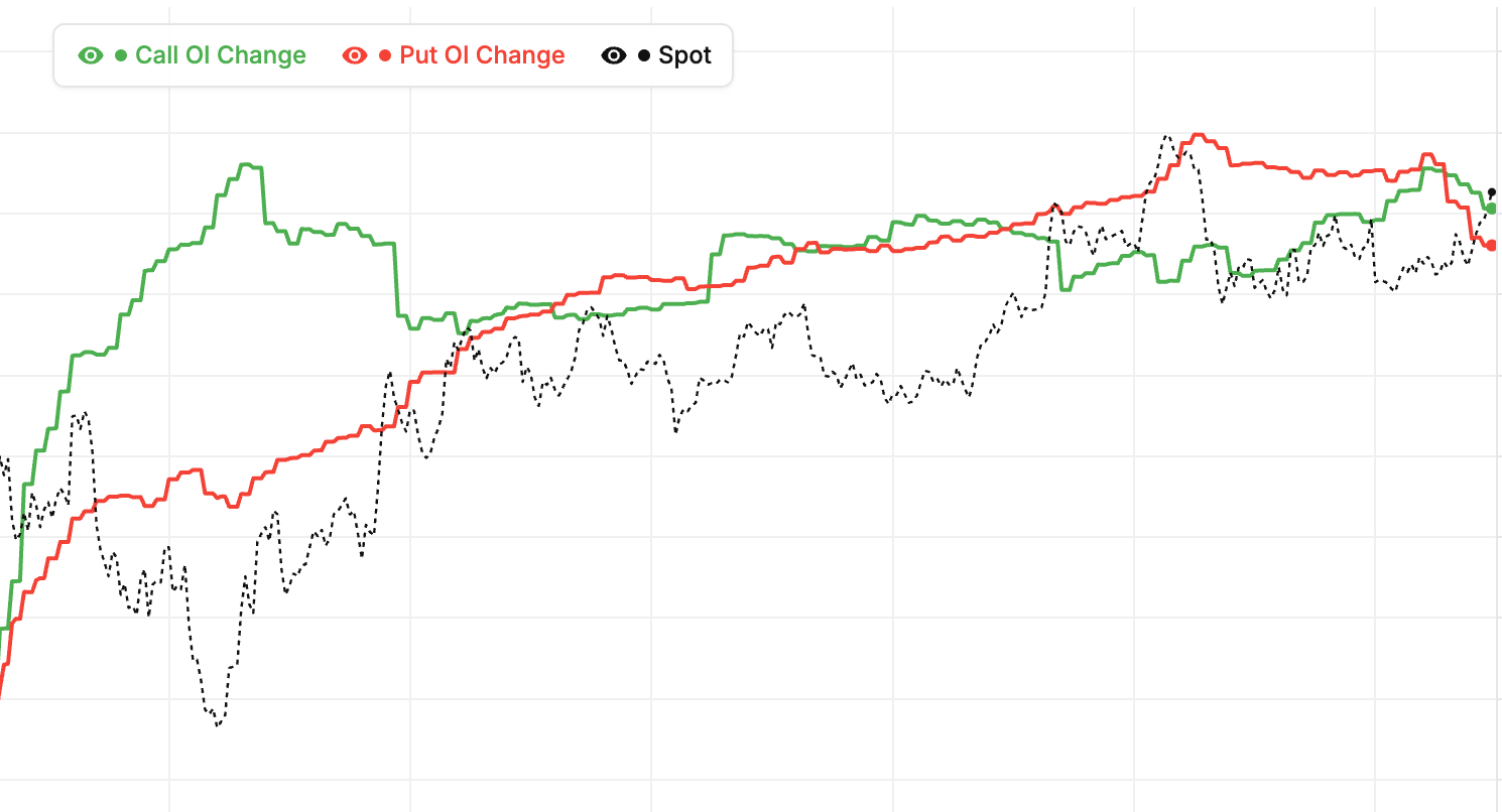
Call vs Put OI for SENSEX is the cleanest real-time read on sentiment positioning in the option market. When total put OI is rising faster than call OI, institutional writers are defending lower strikes — typically a bullish positioning forSENSEX. When call OI outpaces put OI, the ceiling is getting heavier and upside momentum tends to stall. Our chart plots both series side by side so the divergence is obvious at a glance.
The underlying Put-Call Ratio (PCR) derived from SENSEX OI distribution is one of the most-followed sentiment metrics in Indian F&O. PCR above 1.3 usually signals heavy put writing (bullish), below 0.7 signals heavy call writing (bearish), and readings between 0.9 and 1.1 are neutral zones where the market waits for a directional catalyst. We calculate SENSEX PCR live from the NSE option chain and update it across the full trading session, including each expiry separately so weekly and monthly positioning are never conflated.
Reading the SENSEX call-vs-put OI battle intraday
Watch the SENSEX call-put OI gap during the first hour of trade. Institutional option writers commit their positioning early, and the direction of that first-hour commitment often sets the day's bias. If the gap widens in puts' favour while spot holds, that's confirmation of bullish intent. If calls keep adding into a rally, the rally is usually being sold into. The live mode streams updates throughout the NSE F&O session so you can react as positioning changes.
Pair Call vs Put OI with our PCR Tracker, Max Pain Calculator, and Live Option Chain for complete SENSEX positioning context on NSE.
SENSEX Live Call vs Put OI Analysis
Compare total call and put open interest for SENSEX across the strike window you choose, with the futures price on the same time axis. The Total OI chart shows the standing positions on each side; the OI Change chart isolates what has been added or unwound today, measured from the day's open. Read together they separate legacy positioning from today's fresh commitment.
Understanding SENSEX Call vs Put OI and the Put-Call Ratio
Most option writing in SENSEX is institutional. When put OI pulls away from call OI, large desks are committing capital to defend lower strikes — usually read as bullish positioning. The reverse pattern means the ceiling is getting heavier and rallies are being sold into. Because both lines are plotted against the future, you can see immediately whether a price move is being backed by fresh writing or fought by it.
The summary bars above the charts give the current call and put totals alongside the day's change, so the balance is readable at a glance. Narrow the strike window to ATM ± 5 to focus on where the intraday battle actually happens, or widen it to All to judge the full expiry. Pair this with our PCR Tracker, Max Pain Calculator, and Call vs Put Volume to confirm whether the day's OI shift was backed by real traded volume.
BSE Sensex (SENSEX) Call vs Put OI: Historical Mode
Why study historical SENSEX ratios
Historical mode lets you replay the Call vs Put OI chart from any past trading day. This is valuable for seeing how the ratio behaved before major moves, learning which patterns preceded reversals, and calibrating your interpretation of current levels. Retrospective study builds skill faster than live trading alone.
Pattern recognition through history
Each weekend, pick one significant BSE Sensex move and replay the Call vs Put OI chart from the days leading up to it. What did the ratio show? Did fresh put writing precede the rally? Did rising call OI warn of the decline? Documenting these observations builds your pattern library.
Extreme readings in history on SENSEX
Find historical instances where the ratio reached extreme levels. What happened afterward? Did mean reversion occur? How long did it take? These answers tell you whether today's extreme readings are likely to produce profitable contrarian trades or whether the current environment is different.
Using history for today's trades on SENSEX as of 21 September 2026
When today's Call vs Put OI looks like a historical pattern you have studied, you have informed context for what might happen next. Historical pattern matching is one of the highest-value skills in options trading — and it only comes from spending time in historical mode.
BSE Sensex (SENSEX) Call vs Put OI: Pro Tips
Tip 1: watch the trend, not just the level
A ratio of 1.1 can be bullish or bearish depending on its direction. Rising from 0.9 to 1.1 is bullish shift. Falling from 1.3 to 1.1 is bearish shift. Direction beats level for short-term decisions on BSE Sensex.
Tip 2: focus on strike-level detail
Aggregate ratio is useful but strike-level imbalances are more actionable. Find the strikes where call OI vs put OI is most extreme. Those strikes are your strongest support and resistance. Build your trades around them.
Tip 3: cross-reference with FII data on SENSEX
BSE Sensex Call vs Put OI is heavily influenced by FII positioning. NSE publishes daily FII options data — cross-reference it with the chart for institutional confirmation.
Tip 4: keep a SENSEX journal as of 21 September 2026
Daily notes about the chart build insight over time. Document what you saw, what you expected, and what happened. Over 60-90 days, patterns emerge that generic guides cannot teach. The journaling habit is the highest-ROI activity for options traders developing real skill.
BSE Sensex (SENSEX) Call vs Put OI: Combining With Price Action
Why combine OI data with SENSEX price
Call vs Put OI tells you about sentiment and commitment. Price action tells you about actual direction. Using both simultaneously is much more reliable than using either alone. Agreement between price and OI produces high-conviction setups. Disagreement warrants caution.
Bullish confluence on SENSEX
The strongest long setups combine: rising BSE Sensex price, rising put OI, and falling call OI. All three point bullish. Enter with normal or larger size, set stops below key support, target the next resistance. These multi-signal setups are worth waiting for rather than chasing every move.
Bearish confluence on SENSEX
The mirror setup: falling price, rising call OI, falling put OI. All three point bearish. Enter shorts or buy puts with confidence. Stops above resistance, targets at next support. These confluences appear a few times per month on SENSEX but produce the cleanest trades.
Divergences on SENSEX as of 21 September 2026
When price and Call vs Put OI disagree, reversals often follow. Price rising with rising call OI = rally being faded by sellers. Price falling with rising put OI = decline being absorbed by bulls. Both often resolve in favor of the OI side. Watch for these divergences carefully.
SENSEX call vs put OI patterns: quick reference
| OI pattern | Positioning | Common reading |
|---|---|---|
| Put OI rising faster than call OI | Put writers committing | Bullish bias; lower SENSEX strikes being defended |
| Call OI rising faster than put OI | Call writers committing | Bearish bias; overhead resistance building on SENSEX |
| Both sides rising sharply | Two-sided writing | Volatility expected; event positioning before a catalyst |
| Put OI unwinding while calls add | Support being abandoned | Warning for bulls; rallies likely to be sold into |
| Put OI crossing above call OI | Bullish regime crossover | High-conviction sentiment shift favouring SENSEX upside |
These patterns describe how NSE option writers typically commit capital, not mechanical rules — always confirm against the SENSEX futures line plotted on the same chart. The live view above refreshes every minute during market hours, and the change-in-OI panel isolates today's fresh writing so you can spot which pattern is forming in real time.
How to read Call vs Put OI
- Pick symbol and expiry — Choose Nifty, BankNifty, or any F&O stock and select the expiry cycle you want to analyse.
- Watch first-hour slope — Note how call OI and put OI are moving in the opening hour. Faster-growing put OI is bullish commitment; faster-growing call OI is bearish.
- Check the PCR reading — The Put-Call Ratio derived from the chart gives an instant sentiment read. Above 1.3 bullish, below 0.7 bearish, 0.9-1.1 neutral.
- Spot regime changes — Watch for crossovers — moments when put OI rises above call OI (or vice versa). These often mark high-conviction directional shifts.
- Confirm with price — High-conviction setups require OI direction and price direction to agree. When they disagree, wait for confirmation before entering.
SENSEX Call vs Put OI — Frequently Asked Questions
What is the SENSEX Call vs Put OI chart?
The SENSEX Call vs Put OI chart plots total call open interest against total put open interest from the live NSE option chain, alongside the futures price. Because the two OI lines sit side by side, you can see instantly which side option writers are loading up on and how the SENSEX sentiment balance shifts through the session.
What does rising put OI vs call OI mean for SENSEX?
Put OI rising faster than call OI is typically bullish for SENSEX. Option writing on NSE is dominated by institutions, and put writers only add positions at strikes they expect to hold — so accelerating put OI means lower levels are being defended with real capital. When call OI grows faster instead, the ceiling above SENSEX gets heavier and rallies tend to stall.
What is a call-put OI crossover on SENSEX?
A crossover happens when total put OI moves above total call OI on the SENSEX chart, or vice versa. It marks a regime shift in positioning: the side that takes the lead usually sets the near-term bias. Crossovers confirmed by a matching move in the SENSEX futures price are far higher-conviction signals than crossovers that price ignores.
Should I track total OI or change in OI for SENSEX intraday?
Use the change-in-OI view for SENSEX intraday: it resets each session, so it isolates only the fresh call and put writing committed today. Total OI is cumulative and moves slowly, which makes it better for judging multi-day positioning and expiry-week structure. StockMojo plots both SENSEX views one below the other so you can compare them directly.
How often does SENSEX Call vs Put OI data update?
During NSE market hours (9:15 AM to 3:40 PM IST) the SENSEX Call vs Put OI chart refreshes every minute from live option chain open interest. Outside market hours it shows the last traded session, and historical mode lets you replay call vs put OI for any past SENSEX trading day and expiry.