Historical Call vs Put OI Analysis
Gain real-time insights with visual comparison of Call vs Put open interest (OI) and Put-Call Ratio (PCR) for . Identify institutional market sentiment, resistance zones, and support levels across all key strikes.
OI Change (Call vs Put) -
Total OI (Call vs Put) -
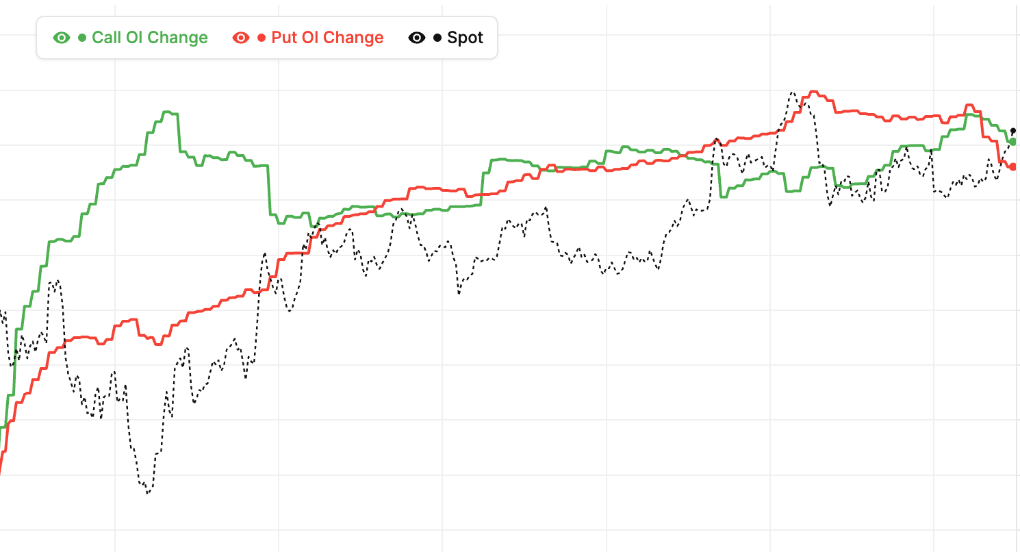
Nifty 50 (NIFTY) Call vs Put OI: Session Dynamics
How the NIFTY ratio changes intraday
The Call vs Put OI ratio updates through the day as traders create and close positions. Morning activity sets the day's initial bias. Mid-day is usually stable. Afternoon activity — especially the final hour — often causes meaningful shifts as institutions position for the next session. Watching the intraday evolution is more useful than a static snapshot.
Opening-hour patterns on NIFTY
The first 30-60 minutes reveal overnight institutional decisions. Rapid changes in call or put OI during this window indicate fresh positioning. Growing put OI in the morning is bullish; growing call OI is bearish. Use this opening pattern to confirm or adjust your pre-market bias.
Final-hour patterns on NIFTY
In the last hour (2:30-3:30 PM), institutional traders make their end-of-day positioning moves. Watch for significant OI shifts — they often predict the next session's direction. A strong shift in the final hour is one of the most reliable signals the chart generates.
Session-long observation on NIFTY as of 2 July 2026
At the end of each trading day, note how the Call vs Put OI ratio evolved. Did it start balanced and shift bullish? Start bearish and reverse? These session-long patterns build your intuition over time. Consistent observation is the fastest path to skill.
Nifty 50 (NIFTY) Call vs Put OI: Strike Distribution
What does NIFTY OI distribution reveal?
Beyond the total call vs put OI, the distribution across strikes matters. Is OI concentrated at a few strikes or spread across many? Concentrated OI indicates strong conviction at specific levels — those strikes matter. Spread OI indicates uncertainty or broad hedging — the specific levels matter less individually.
Concentrated NIFTY OI patterns
When put OI is concentrated at one or two strikes just below current price, support is narrowly defined. Expect strong reactions at those specific levels. When call OI is concentrated at specific strikes above, resistance is sharp. These narrow concentrations often act as magnets or walls for price action on Nifty 50.
Spread NIFTY OI patterns
When OI is spread across many strikes, no single level dominates. Price can move more freely without encountering strong resistance or support. These environments are more suitable for trend trading than level-based trading because the chart does not offer sharp entry or exit points.
Reading distribution as of 2 July 2026
Look at the Call vs Put OI chart not just for totals but for how the OI is distributed across strikes. Concentrated distributions call for level-based strategies. Spread distributions call for trend or range strategies. Adapting to the distribution improves your strategy fit on NIFTY.
Call vs Put OI & PCR Analysis - NIFTY
Expert insights into NIFTY Open Interest, Put-Call Ratio, and Option Market Trends • Historical Analysis
Call vs Put OI analysis for NIFTY is a visual representation of the open interest (OI) levels for Call and Put options across different time intervals. It helps traders understand the market sentiment by comparing the total number of outstanding Call contracts versus Put contracts. This tool is essential for calculating the Put-Call Ratio (PCR) and identifying whether the smart money is bullish or bearish on NIFTY.
Interpreting the NIFTY Call vs Put OI chart involves looking at the relationship between the two lines:
1. Bullish Sentiment: When Put OI is significantly higher than Call OI, it often indicates a bullish sentiment as traders are writing more puts, expecting the price of NIFTY to stay above certain support levels.
2. Bearish Sentiment: When Call OI is higher than Put OI, it suggests a bearish bias, as call writers expect NIFTY to face resistance and stay below strike prices.
3. Crossovers: A crossover where Put OI moves above Call OI (or vice versa) can signal a potential shift in market momentum during the null session.
The Put-Call Ratio (PCR) for NIFTY is a sentiment indicator derived from this data. A PCR value above 1 typically indicates bullishness (more puts being written), while a PCR below 1 indicates bearishness. Traders use the NIFTY PCR to identify overbought or oversold conditions and potential market reversals.
Changes in Open Interest (OI) for NIFTY provide clues about new positions being formed.
• Price Up + OI Up: Strong Bullish (Long Buildup)
• Price Down + OI Up: Strong Bearish (Short Buildup)
• Price Up + OI Down: Short Covering
• Price Down + OI Down: Long Unwinding
Tracking these changes strike-by-strike for NIFTY helps in identifying the strongest support and resistance zones.
The Total OI chart shows the cumulative outstanding contracts for NIFTY, reflecting long-term positioning. The OI Change chart focuses on the positions added or removed during the null session, which is more useful for intraday traders looking to spot immediate trend shifts in NIFTY.
For a comprehensive analysis of NIFTY, combine this tool with:
Direct Put-Call Ratio trends for NIFTY
Real-time Greeks, IV, and strike-wise OI for NIFTY
Identify the strike where NIFTY is likely to settle at expiry
Compare multiple strikes' OI trends head-to-head for NIFTY
Analyze the difference between Put and Call OI for NIFTY
Understanding Call vs Put OI & Put Call Ratio (PCR)
Welcome to the most advanced Call vs Put OI analysis platform. Our real-time dashboard provides a visual comparison of Call and Put open interest levels, enabling traders to gauge market sentiment for Nifty, BankNifty, and major F&O stocks.
The Put Call Ratio (PCR) is a vital indicator for determining potential market reversals. When you monitor the PCR live chart, you can spot overbought or oversold conditions before they happen. Our tool updates every few minutes, ensuring you have the latest option buildup data for the market session.
Whether you are looking for long buildup, short covering, or identifying key resistance and support levels via option OI distribution, this chart is your go-to resource for professional options trading in the Indian stock market.
About the Call vs Put OI Chart
This chart plots total call open interest against total put open interest, live, for every active expiry on Nifty, BankNifty, FinNifty and the F&O stock universe. The Put-Call Ratio sits underneath as a separate line. PCR tells you the level. The side-by-side OI tells you how that level got there.
Most of the writing on either side is institutional. When put OI starts pulling away from call OI, large desks are committing to defend lower strikes. That is a directly tradeable signal of bullish positioning. The reverse pattern shows the ceiling getting heavier. We surface PCR alongside the raw lines so regime flips are obvious without having to eyeball ratios.
Reading the chart intraday
The first hour matters most. Institutions commit fresh writes between 9:15 and 10:30 IST, and the gap that opens up between the two lines usually sets the day's bias. Mid-session unwinds, where puts get dropped while calls add aggressively, are a classic warning that a rally is losing institutional support. Weekly expiries react faster. Monthlies show deeper conviction.
Pair this view with our Put-Call Ratio Tracker, Max Pain Calculator, and Open Interest Analysis to read positioning across strikes and expiries.
Frequently Asked Questions
What does Call vs Put OI tell me about the market?
Call vs Put OI compares the total open interest on the call side with the total on the put side. When put OI rises faster than call OI, institutional writers are defending lower strikes, which is typically bullish positioning. When call OI builds faster, the ceiling is getting heavier and upside tends to stall. The chart shows where professional money is committing capital, in real time.
How is the Put-Call Ratio (PCR) calculated?
The formula is simple. PCR equals the total open interest of put options divided by the total open interest of call options on the same underlying. On Nifty, the historical range is roughly 0.8 to 1.3. Readings outside that band carry information; anything above 1.5 or below 0.5 is at the extreme end where contrarian signals tend to fire.
How do I use the PCR for trading decisions?
Use it as a sentiment gauge with a contrarian twist. Above 1.3 means heavy put writing (bullish — writers are confident the strike will hold). Below 0.7 means heavy call writing (bearish ceiling). The reason extreme readings often signal reversals is mechanical: when retail buys lots of puts, the market makers selling them hedge by buying the underlying, which can fuel an upward squeeze. Same logic in reverse below 0.5.
Why focus on OI rather than volume?
Volume measures trades that happen; OI measures positions that remain. A single trader can generate massive volume churning in and out, but OI only rises when net new positions are created. For gauging true directional commitment, OI is the cleaner signal — especially when compared call vs put to reveal which side is accumulating.
How does Call vs Put OI behave near expiry?
As expiry approaches, OI on out-of-the-money strikes typically collapses as those options roll off. ATM and ITM strikes retain more OI as they settle. The shape of the final-day Call vs Put OI distribution often hints at the settlement price — heavy put OI below spot suggests downward gravity; heavy call OI above suggests upward gravity.
Can I trust the first-hour Call vs Put OI readings?
Somewhat. The first hour captures institutional positioning commitment but is also the most volatile in terms of OI flow as positions open and close rapidly. The direction and slope of the first-hour reading is usually reliable; the absolute level stabilises by 10:30 AM as session positioning settles.
What happens when Call OI and Put OI both increase aggressively?
Parallel growth in both sides usually signals anticipated volatility — traders are positioning for a big move in either direction. This often happens before major events (budget, RBI policy, results week). The absolute side (calls or puts) that grows faster tells you the directional bias, but the parallel growth itself is a volatility signal.
How to read Call vs Put OI
- Pick symbol and expiry — Choose Nifty, BankNifty, or any F&O stock and select the expiry cycle you want to analyse.
- Watch first-hour slope — Note how call OI and put OI are moving in the opening hour. Faster-growing put OI is bullish commitment; faster-growing call OI is bearish.
- Check the PCR reading — The Put-Call Ratio derived from the chart gives an instant sentiment read. Above 1.3 bullish, below 0.7 bearish, 0.9-1.1 neutral.
- Spot regime changes — Watch for crossovers — moments when put OI rises above call OI (or vice versa). These often mark high-conviction directional shifts.
- Confirm with price — High-conviction setups require OI direction and price direction to agree. When they disagree, wait for confirmation before entering.